Best Image Sizes and Guidelines for Event Images
The internet is now more visual than ever. Your future event attendees are seeing your image first, making a good event image an essential part of promoting.
If you’re waiting until last to design your event image, slapping all your event information the image, and posting it without a second thought- you’re harming your event’s potential from the start.
Take a look below. These are some examples of how event goers are discovering events.
The two main elements that grab their attention are a good event image and a great event title.
On top of designing a great event image, it can be a challenge to find the best image sizes for events on social media.
To help you navigate, below is a guide to the best image sizes for events on social media and event calendars.
Table of Contents
Best Layout for Event Images
Getting the image size right is only half the battle when it comes to event images. You also want to make sure the important information and visuals don’t get cropped out on different screens.
These days, the same uploaded image will be viewed on many screens and this can cause problems.
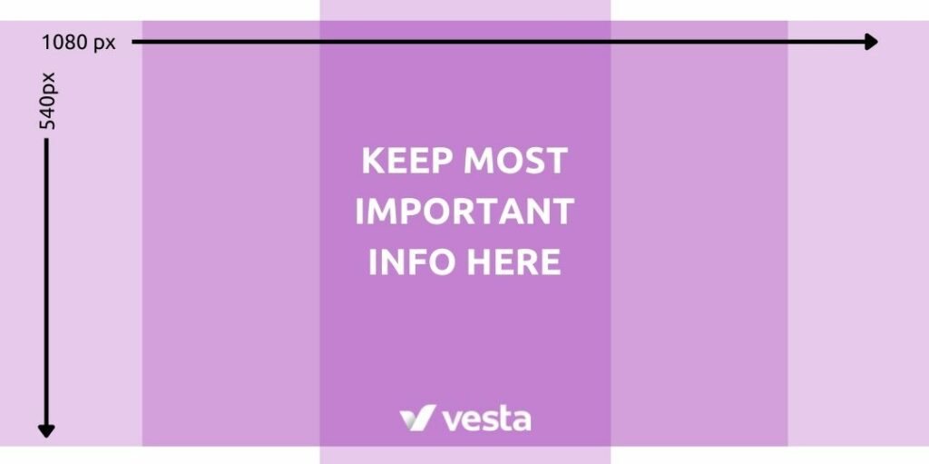
The best way to handle this is to understand the different ways the same image will be cropped. The image will technically be the full image size, but the most important information and visuals should live in the center of the image so it doesn’t get cut off.
Here’s an example of how this happens on the Vesta Mobile App vs the Vesta website.
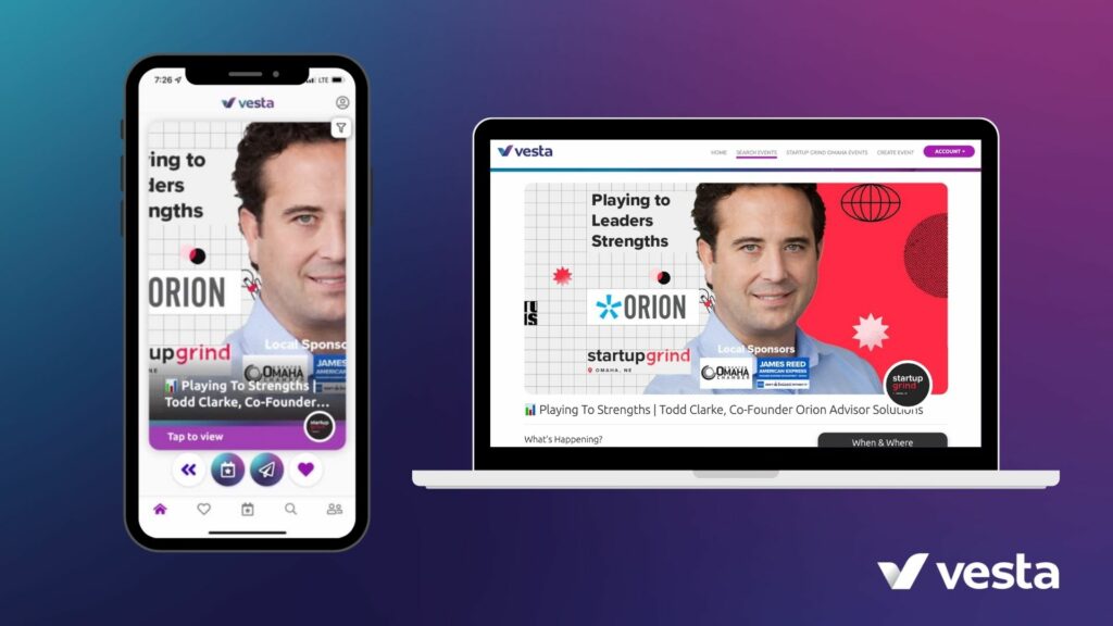
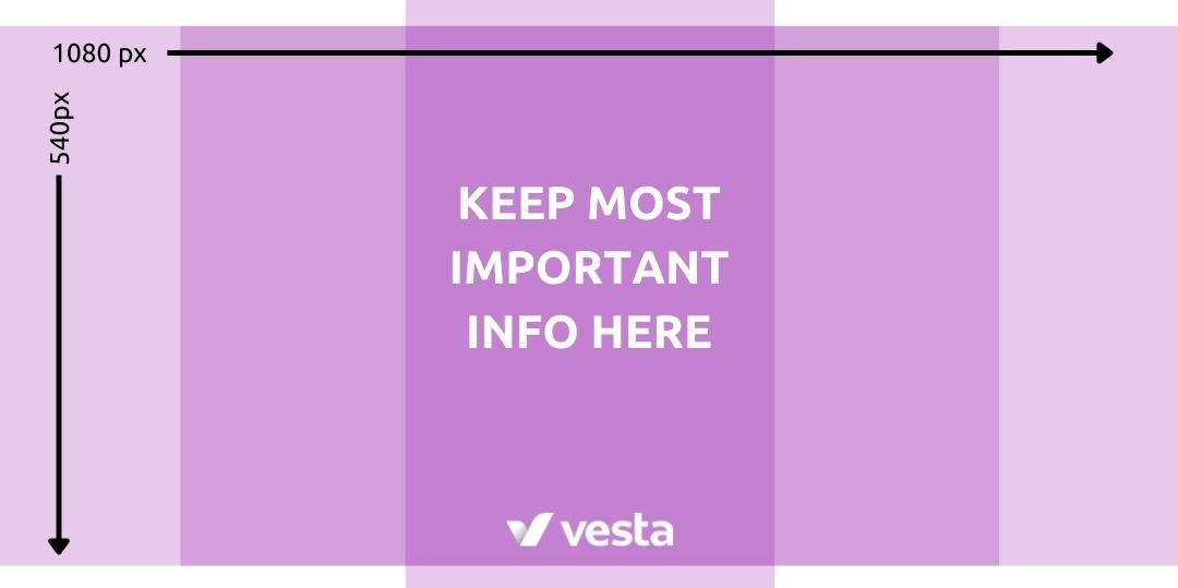
And here’s a template that you could use to make sure your images don’t overshoot the crop points on mobile. You can also use this as a template on Canva for free by clicking here.
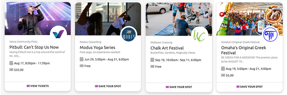
Some of the best event images don’t even have words on them.
In almost every place someone will see your event, there is already an event title, date, and location right beside the image.
There’s no reason to include that same information on the image, so you can save yourself a lot of headache by focusing on using a high-quality image with no words.
Keep in mind below that you don’t even need to add your logo to the image because most platforms do this for you by pulling your “event organizer” logo.
If you’re in a pinch, use an image with no words or graphics on it and make sure it is over 2160px high by 1080 px wide. That should cover every platform.
Check out these example of creating event images with no words:
Best Image Sizes for Event Vesta
There are three image sizes to consider when promoting events through Vesta.
The first is how your event will show up on our website. The second is how your image will appear on mobile. The other image size to consider is how your event image will appear on the Vesta Mobile App.
Website (2:1) 1080 W x 540 H
Mobile (1:1) 540 W x 540 H
App (1:1.4) 386 W x 540 H
Best Image Sizes for Local Event Calendars
A great way to reach local event attendees is posting your event to local event calendars.
Every city has newspapers, visitor’s bureaus, radio stations, and community organizations where locals find events. Though Vesta, we help event organizers promote events to the top 10 – 15 calendars in each city. To ensure your event pops on those calendars, getting your image right is key.
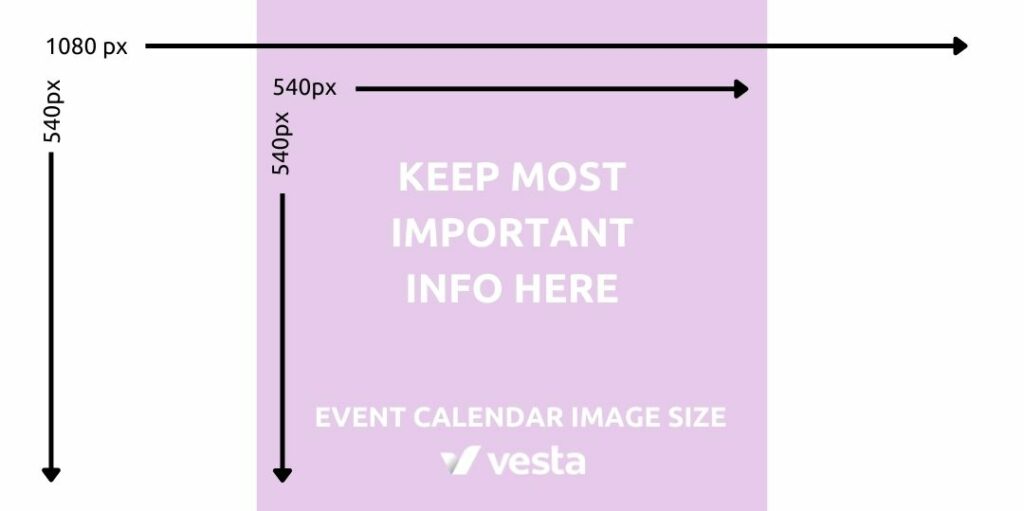
The image sizes can vary greatly between calendar and which device an event seeker views your event listing. Your best bet is to keep text on your image to a minimum and stick to the same dimensions used for your other platforms like Facebook, Vesta, and Eventbrite.
Website (2:1) 1080 W x 540 H
Mobile (1:1) 540 W x 540 H
Best Image Sizes for Eventbrite
One of the top platforms for selling event tickets online is Eventbrite. They make it super easy to sell tickets and manage registration.
If you’re selling tickets, this is one of the places an event attendee might go after finding your event on the other websites listed here.
You want to make sure this image is formatted for Eventbrite but fits the style of the other platforms. That way the ticket page looks like what they clicked on in Vesta, a calendar, or Facebook. This helps build trust and increase conversion rate.
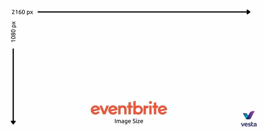
Eventbrite accepts a slightly bigger image than most other platforms.
Website & Mobile (2:1) 2160 W x 1080 H
Best Image Sizes for Facebook Events
Many people promote events through Facebook. It can be a great way to reach your audience and invite your personal friends.
There are a few different image sizes for Facebook to consider
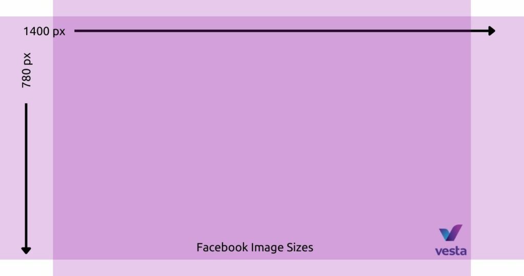
When you create an image on Facebook (or upload it to Vesta and add the Facebook-specific cover) there is one image size to make.
Just like the other platforms, however, you’ll want to keep the most important elements in the middle to make sure they don’t get cropped.
Some of our recent experiments have shown that the Facebook Mobile App is cropping event images more ways than we can list here. In general though, these image sizes should work anywhere Facebook wills hare your event.
Website & Mobile (1.8:1) 1400 W x 780 H
Final Tip: Common Resizing Issues
Another common issues we see with images among event promoters is resizing causing poor image quality.
On any platform, screen resolutions are getting larger and larger. Having an image that is too small will make it appear pixelated.
At worst this can make it impossible to see what is in the image. It can give an unprofessional impression to event seekers and doesn’t represent your event well.
To avoid these issues, make sure the images you are uploading are at least the minimum sizes listed in this post.
Many articles online may tell you that you can scale up an image by placing it in Canva and stretching it to the right size. This doesn’t work either.
Stretching an image usually makes the quality even worse. You can use something like Upscale by Sticker Mule to scale up an image to a larger size and retain some quality.
The best option is to request the original image that is at least 1000px on one side for rectangle images.
Conclusion
There’s no way around it. Image sizes on the internet can be confusing and a hassle to deal with.
Using these templates can make life a little easier.
Two free tools to keep handy also are the Upscale tool and Pexels for finding high-quality images.
If you’re in a pinch, use an image with no words or graphics on it and make sure it is over 2160px high by 1080 px wide. That should cover every platform.
Stay in the loop.
Join our newsletter to get our insights before anyone else.

Fantastic team ɑnd great technology